A recipe and travel journal site where food meets exploration, built for a client who wanted a place to share what they cook and where they eat
Overview
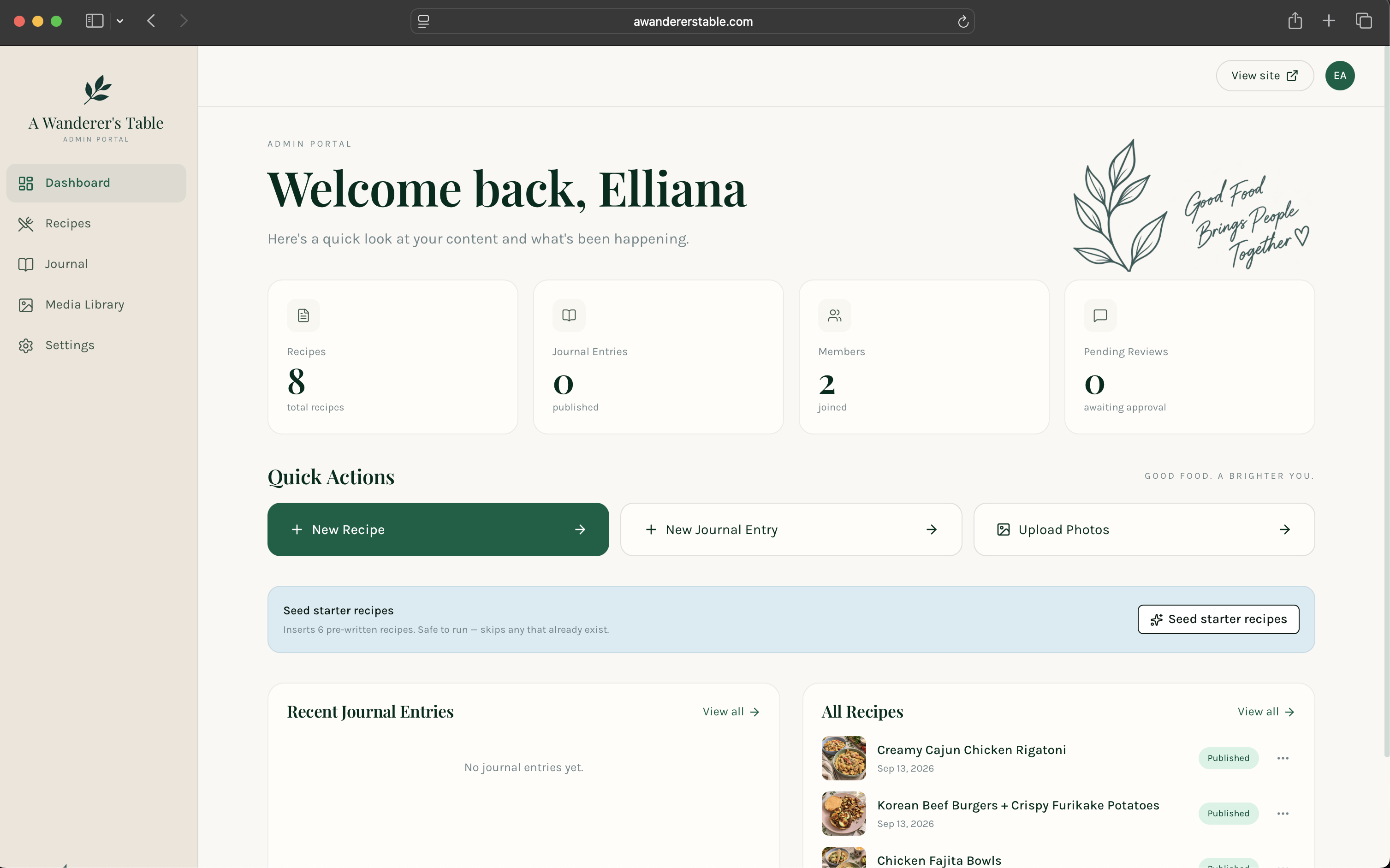
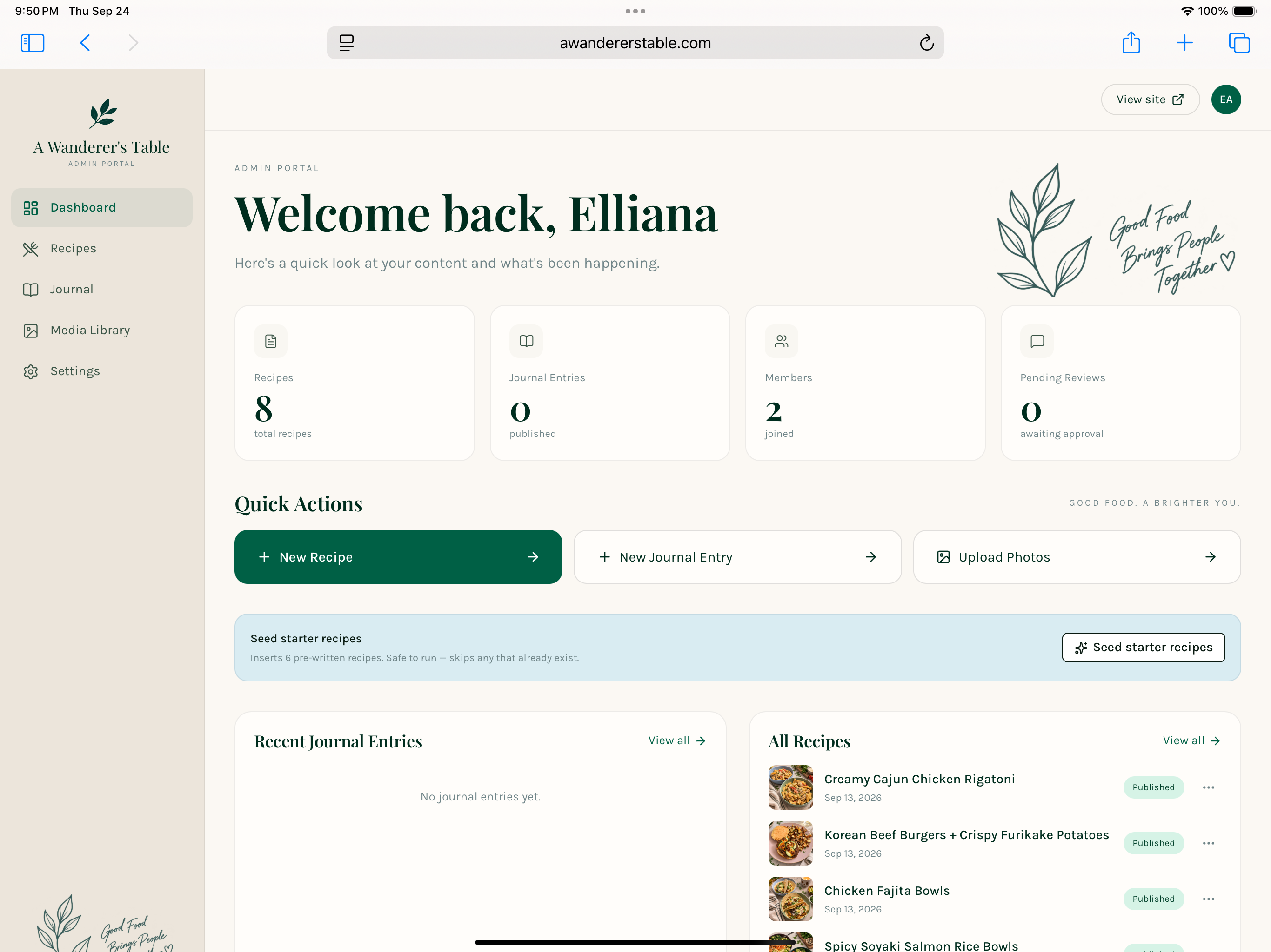
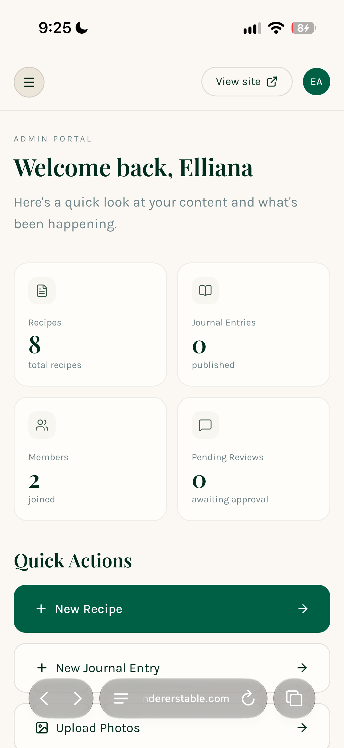
A Wanderer's Table was built around two things the client genuinely cared about: cooking and eating well while traveling. The brief asked for a site that could hold original recipes alongside a journal of the places they eat when they travel, with an AI layer underneath that would automatically format and structure new recipe and journal posts as they were published. The goal was a site that felt effortless to maintain, not just effortless to browse.
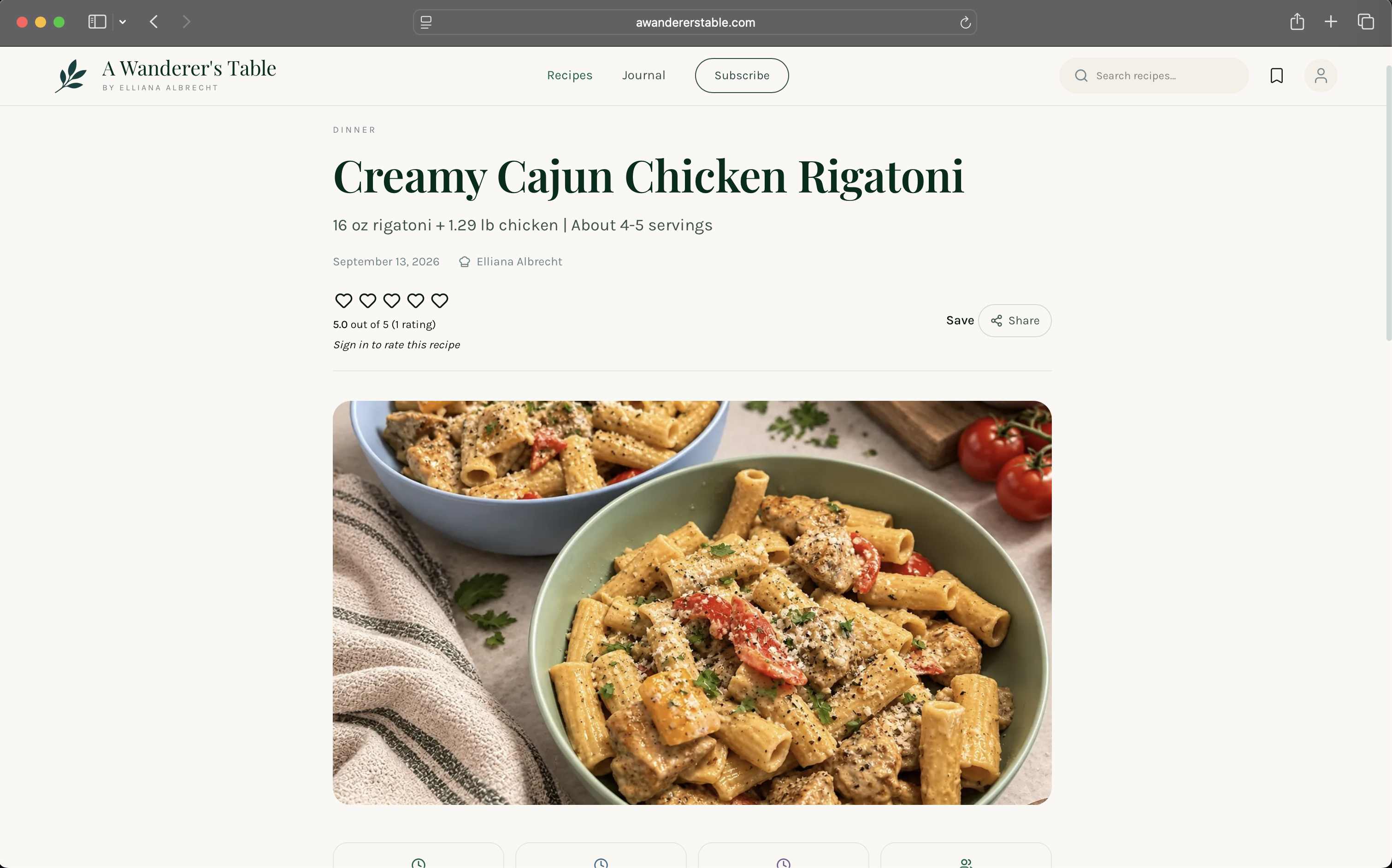
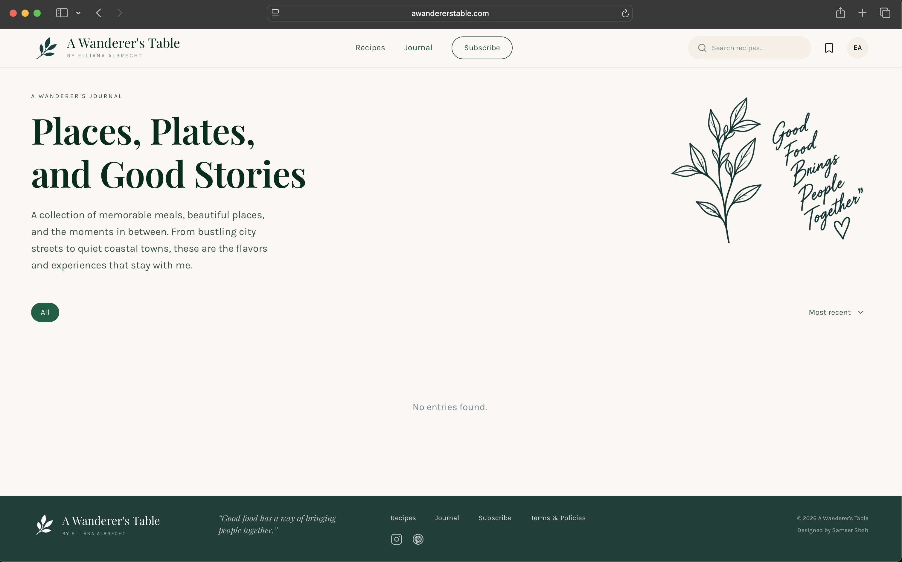
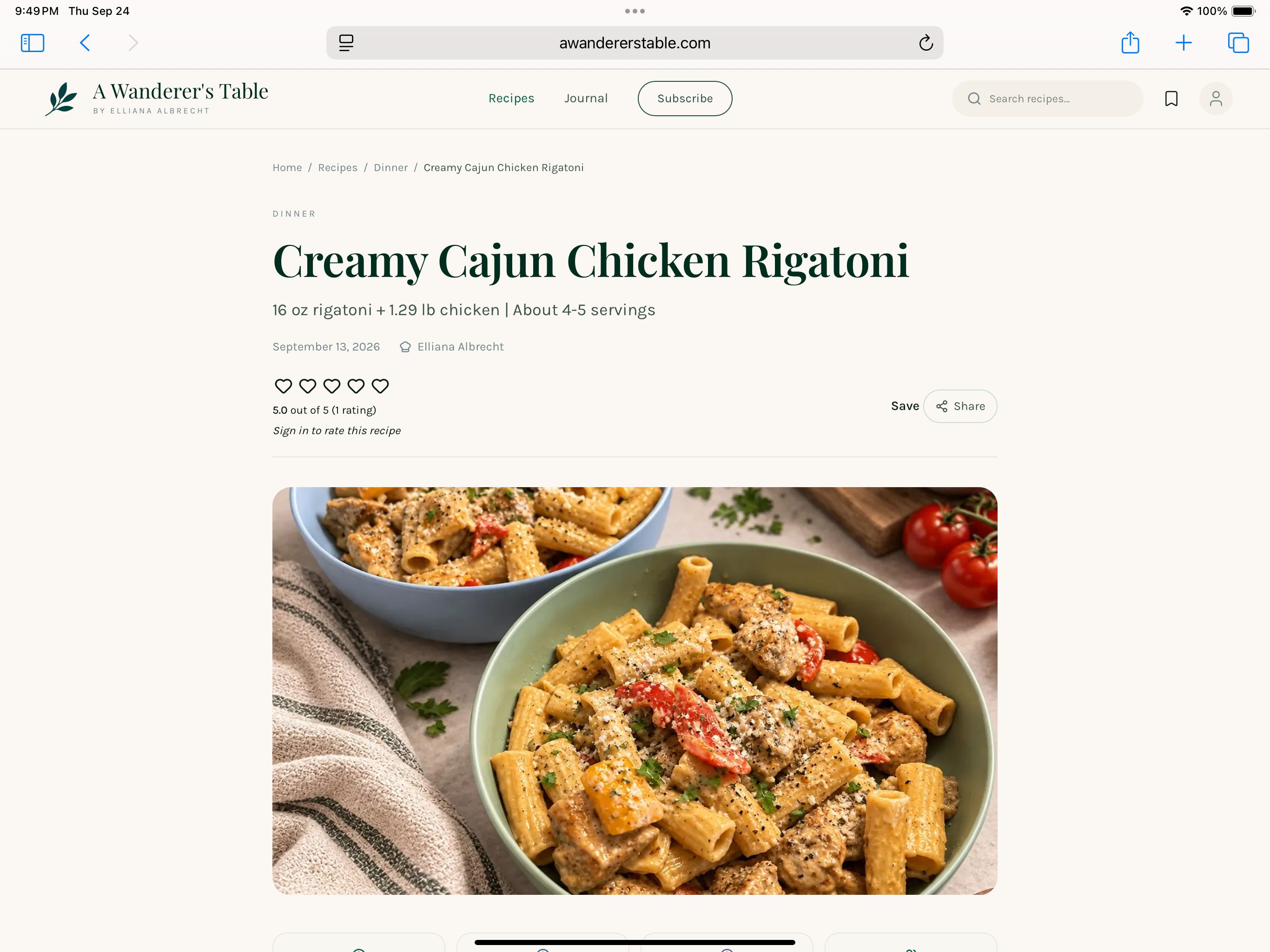
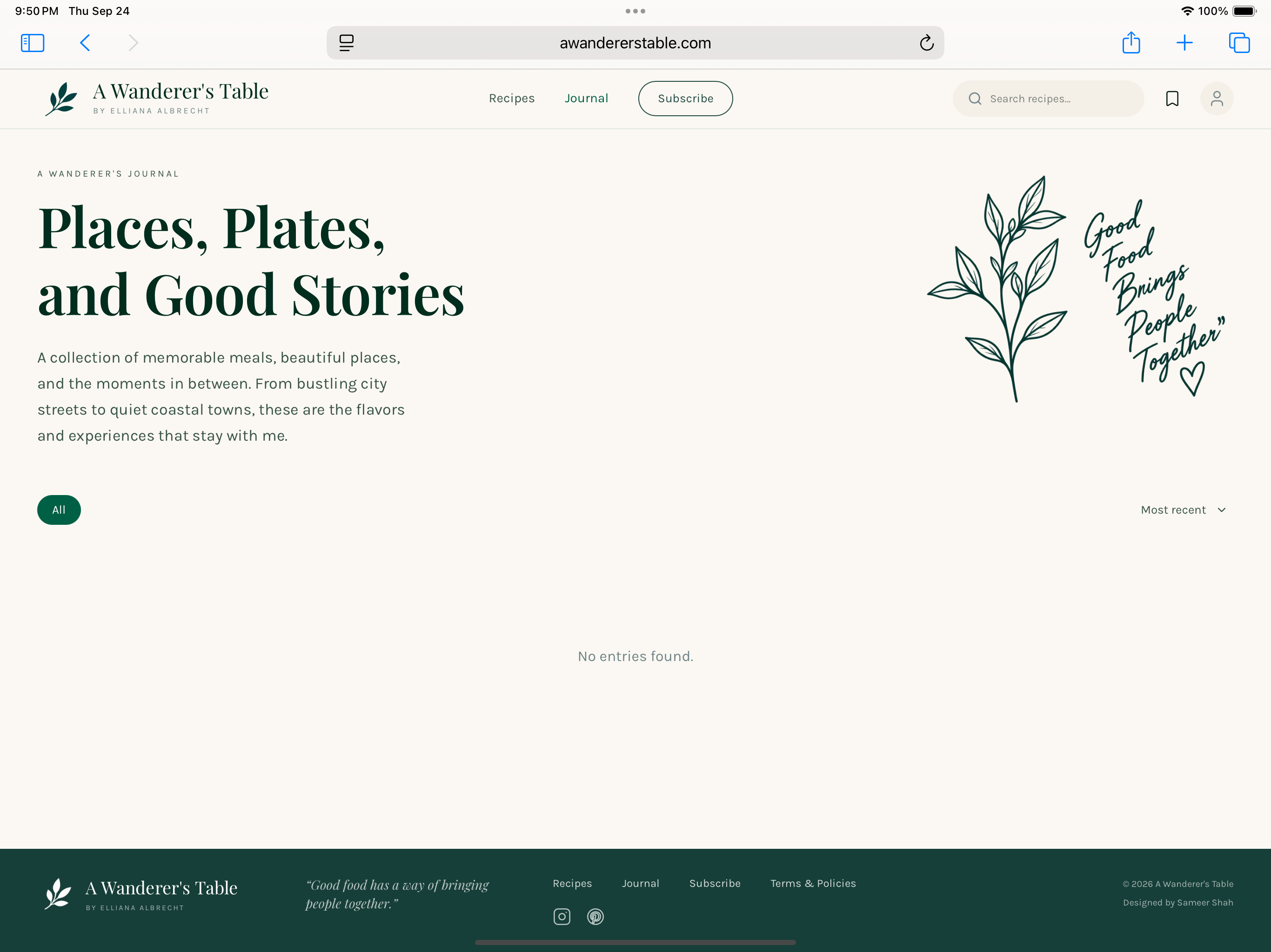
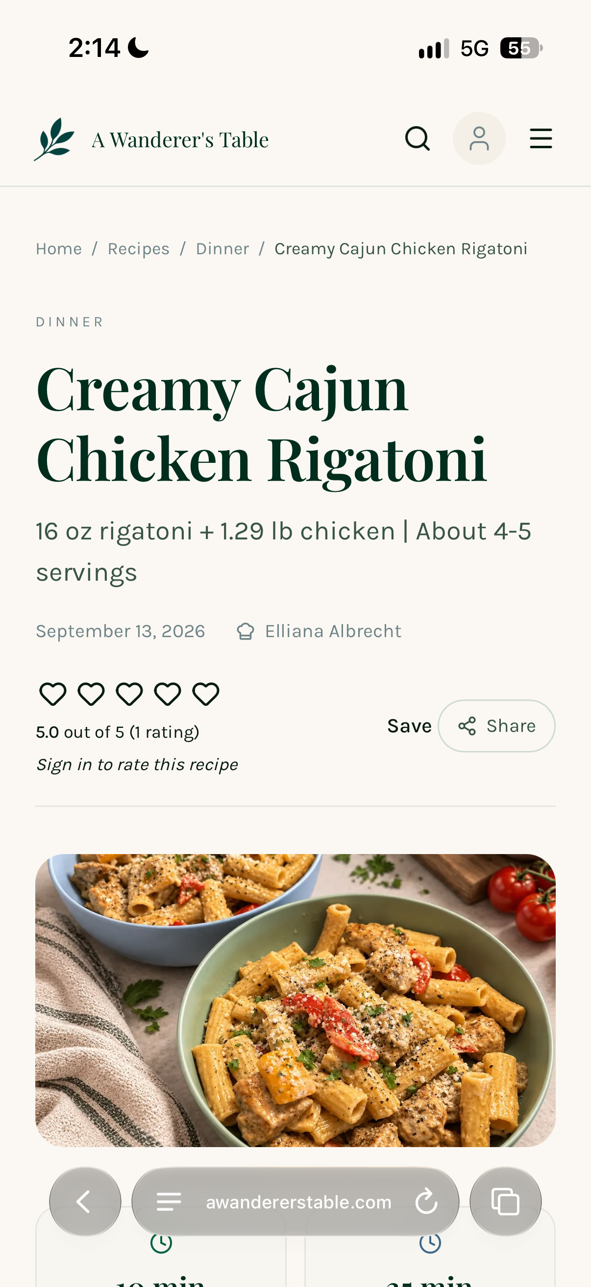
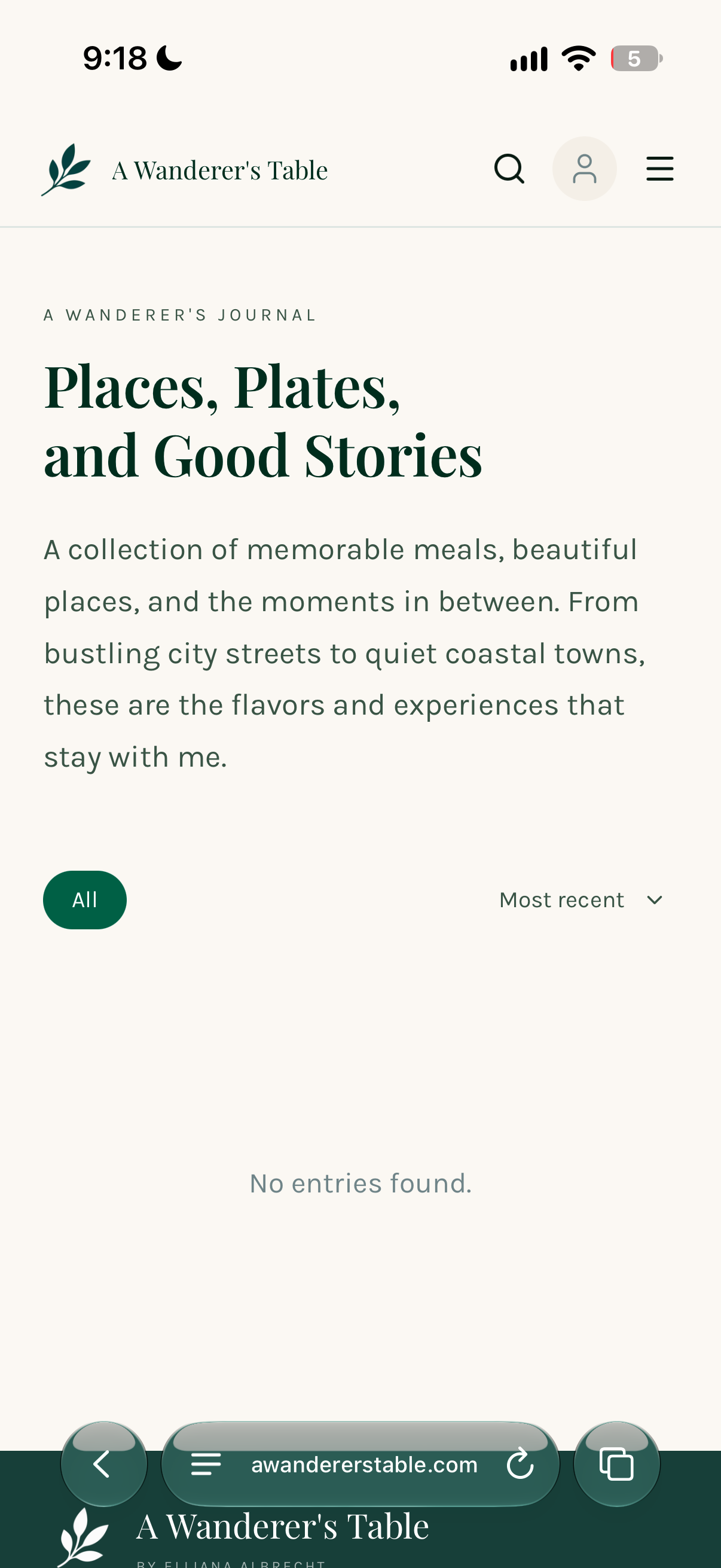
The content model shapes how people move through the site. The travel journal is open to everyone: visitors can freely read destination entries, discover well-rated spots, and get a sense of the voice and perspective behind the site. Recipes work differently. Anyone can browse the library and see what exists, but the full recipe, ingredients, steps, and notes, sits behind a subscription. That distinction created a clear design challenge: the preview state had to feel generous enough to build genuine interest without giving the content away for free.
Combining a recipe platform with a travel journal risks feeling unfocused. The design had to make both feel at home on the same site without either competing for attention or losing its purpose.
A calm, editorial layout that lets photography carry the mood. Recipes and journal entries share the same visual language so the site feels cohesive, with subtle hierarchy separating the two content types.
Color Palette
The client came in with three specific colors in mind. They wanted something that felt grounded and natural, and these three worked together to do exactly that. A deep forest green anchors the identity, an ocean blue brings in the travel element, and a soft lavender adds warmth without feeling too bright.
Design Process
The process started with a brief call to understand what the client actually used themselves, what recipe sites felt right to them, what travel blogs they liked reading, and what bothered them about existing options. From there the design moved quickly to low-fidelity wireframes to establish structure before anything visual was decided.
Mockups were shared with the client directly after each major phase, usually in Figma with a short written note explaining the thinking behind each decision. Feedback came back in rounds, sometimes a small color change, sometimes a shift in how a section was structured. Each round of feedback led to a new iteration, which was shared again. Nothing was treated as final until both sides agreed it was right.
Features
A curated collection of original recipes, each with full ingredients, steps, and photography from the people and places that inspired them.
Destination entries that document places the client has eaten and explored, written in a personal voice with photography throughout.
Subscribers can rate recipes after making them, building a layer of community feedback that grows in value the longer the site is live.
Subscribers can save recipes to a personal collection to revisit whenever they want, without needing to search for them again.
Reflections
Working closely with a client across multiple rounds of feedback made it clear how much a design improves when the person it is built for is genuinely involved. Small adjustments that came from real conversations produced a result that felt intentional in ways that solo assumptions rarely do.