Projects
Re-designing everyday experiences with Accessibility & Privacy in mind
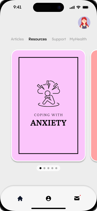
Simplifying Affordable Mental Health Resources
With a user-centered approach, the goal was to create an intuitive interface for simple yet effective mental health management while remaining affordable and beneficial.
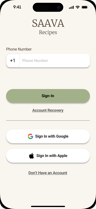
Re-Inventing Recipes with Simplicity in Mind
SAAVA Recipes was designed to address the challenge of overwhelming recipe apps by offering a clean, intuitive interface. It allows users save, organize, and share recipes effortlessly, without unnecessary distractions or complex navigation.
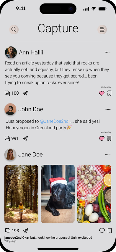
Social Media Designed with Safety & Privacy First
Design Journey
Insights, discoveries, and lessons from the forefront of mobile design innovation
Loading blog posts...
Professional Journey
Elite experience across industry-leading companies and cutting-edge projects
Work Experience
Technical Expert
Apple Inc.
Providing expert hardware and software support for Apple devices, leading complex technical repairs, and delivering exceptional customer experiences through personalized troubleshooting and training.
Technical Specialist
Apple Inc.
Provides hands-on technical support and repairs for Apple devices, delivering personalized solutions and training to enhance the customer experience.
Specialist
Apple Inc.
Guides customers through Apple’s products and services, identifying needs and offering tailored solutions that inspire loyalty and drive sales.
Certifications & Education
Foundations of UX Design
Start the UX Design Process
Build Wireframes & Low-Fidelity Prototypes
Conduct UX Research & Test Early Concepts
Bachelor of Information Technology
Illinois Tech
Associates in Psychology
Santa Rosa Junior College
Ready to Create Magic?
Let's build an app that doesn't just meet expectations—it shatters them. Together, we'll create a mobile experience that users obsess over and competitors envy.